10-day UI challenge
Day 1: Sign up
This is the sign-up layout I created for a Dreamer reader app. Upon registration, you'll be prompted to provide essential details, enabling the app to deliver personalized insights about your dreams.
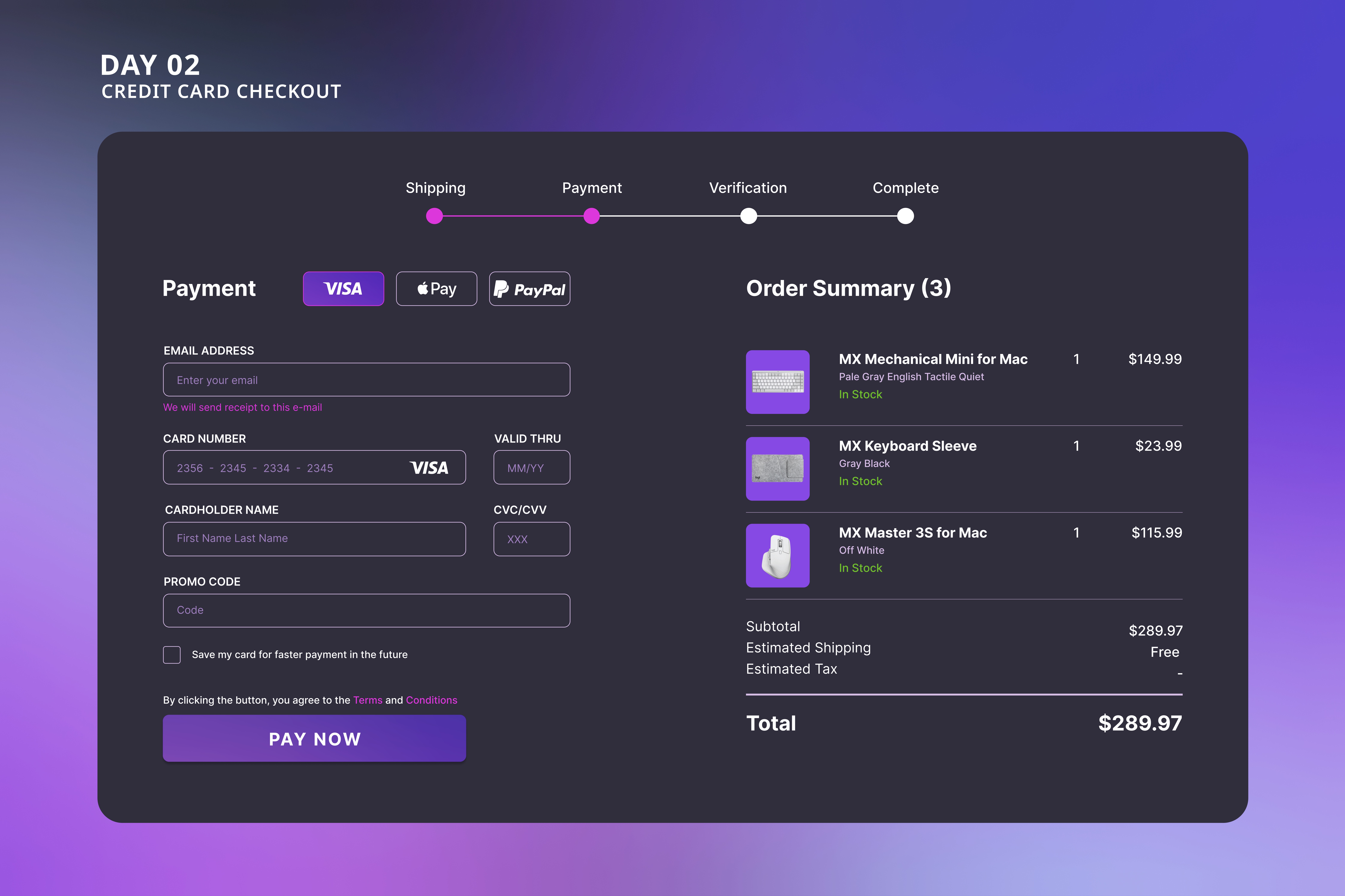
Day2: Credit Card checkout
This UI design facilitates credit card checkout on a gadgets website, providing clear guidance on the necessary fields while ensuring visibility of your cart contents to prevent errors in your purchase.
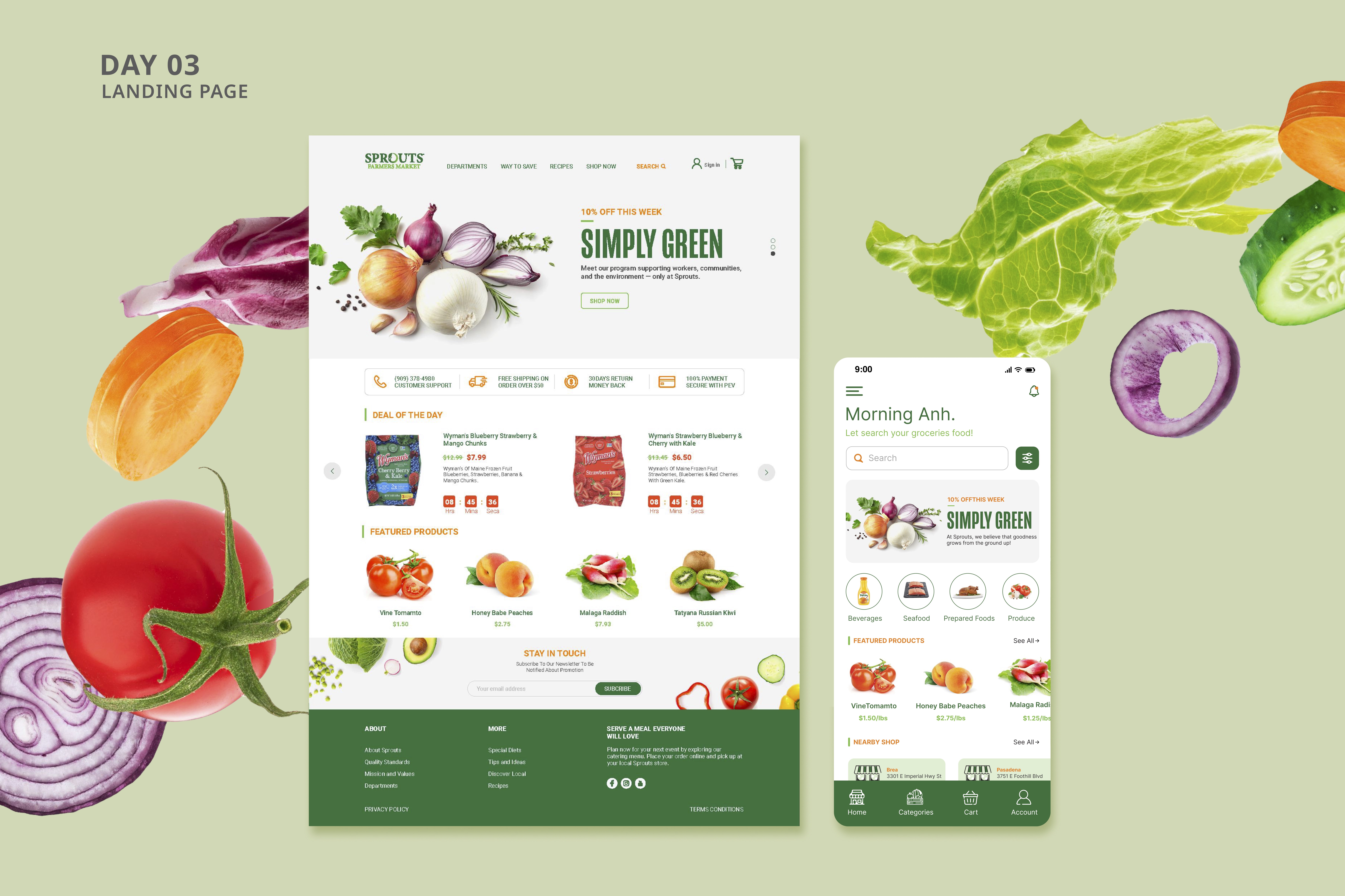
Day 3: Landing page
This UI design showcases the landing page for Sprout, optimized for both desktop and mobile screens. Recognizing the significance of a landing page, I've designed it to exude freshness and warmth, effectively communicating how Sprout can benefit its customers.
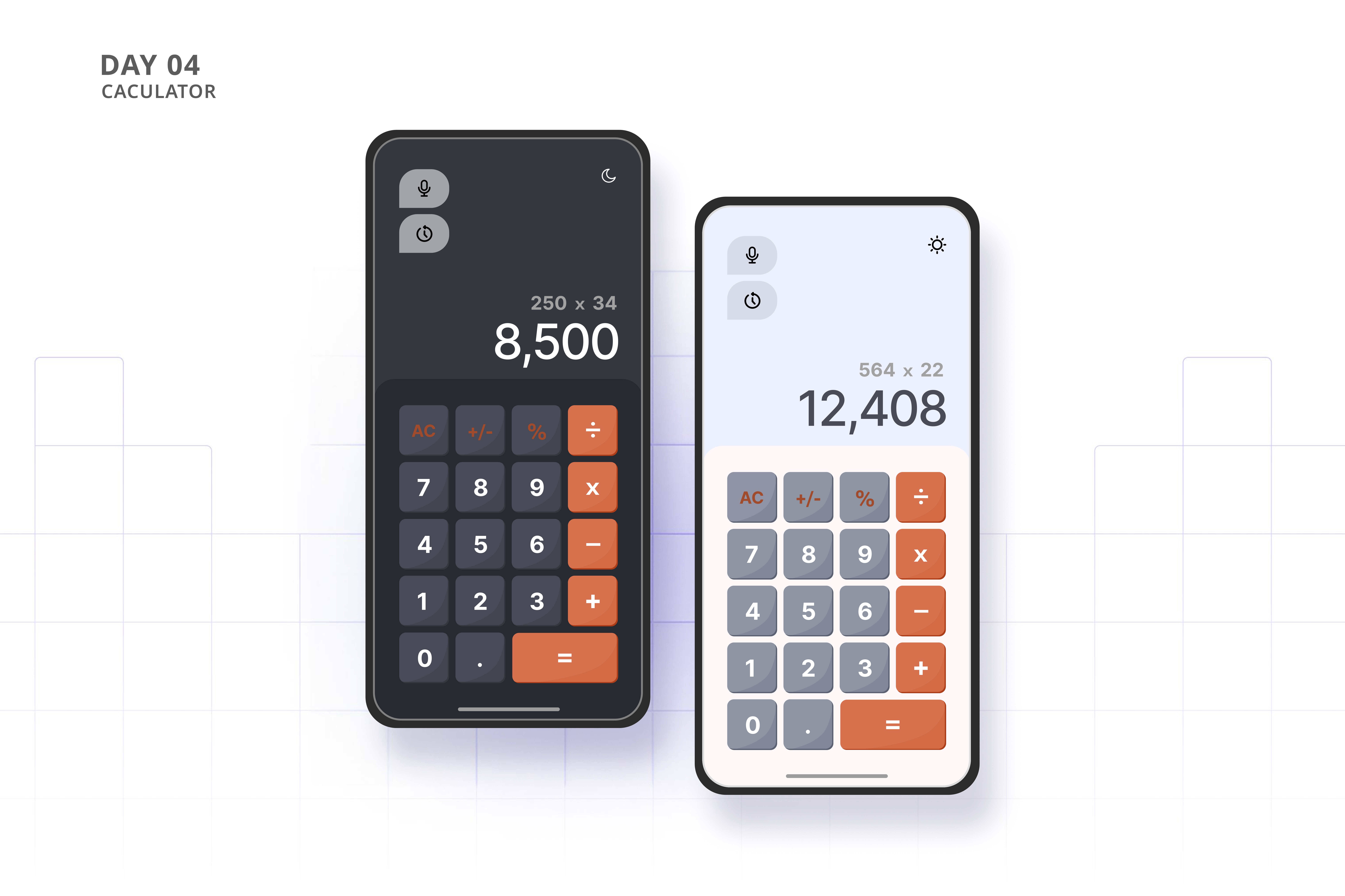
Day 4: Calculator
This is the design for a calculator app on a mobile screen with a very friendly look and easy-to-use functions. It showcases two versions, day and night, so users can switch to whichever one they prefer.
Day 5: App icon
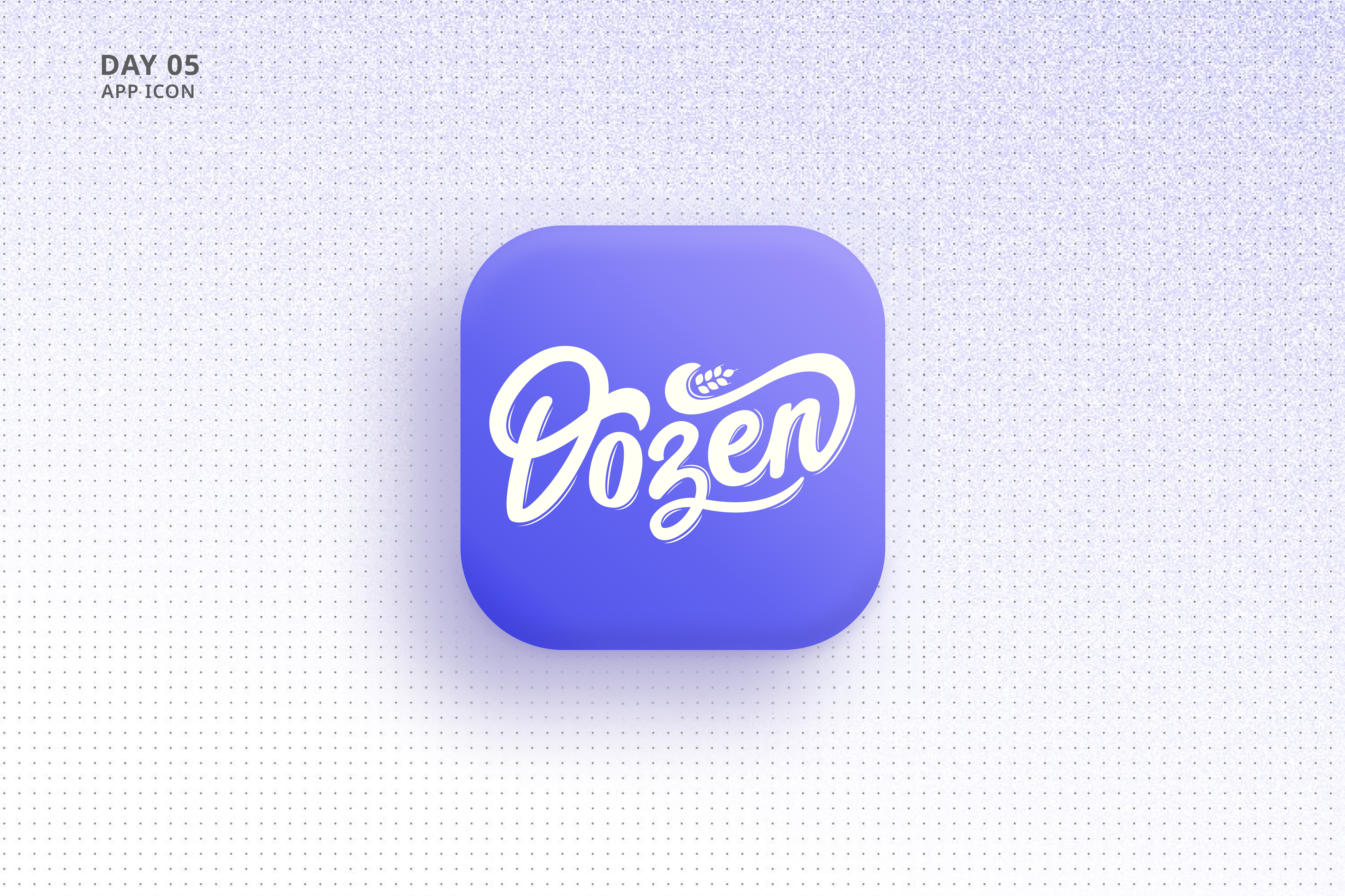
I created the app icon design for a bakery called Dozen, a favorite spot from my childhood that always felt warm and welcoming. To capture that feeling, I hand-drew the typography, giving it a unique and personal touch that reflects the charm of the bakery. The design prioritizes readability and recognition, with a simple color palette of white and purple that nods to the bakery’s cozy, inviting atmosphere. I wanted the icon to feel familiar yet fresh, like the comfort of a warm pastry from a place you’ve always loved.
Day 6: User profile and settings
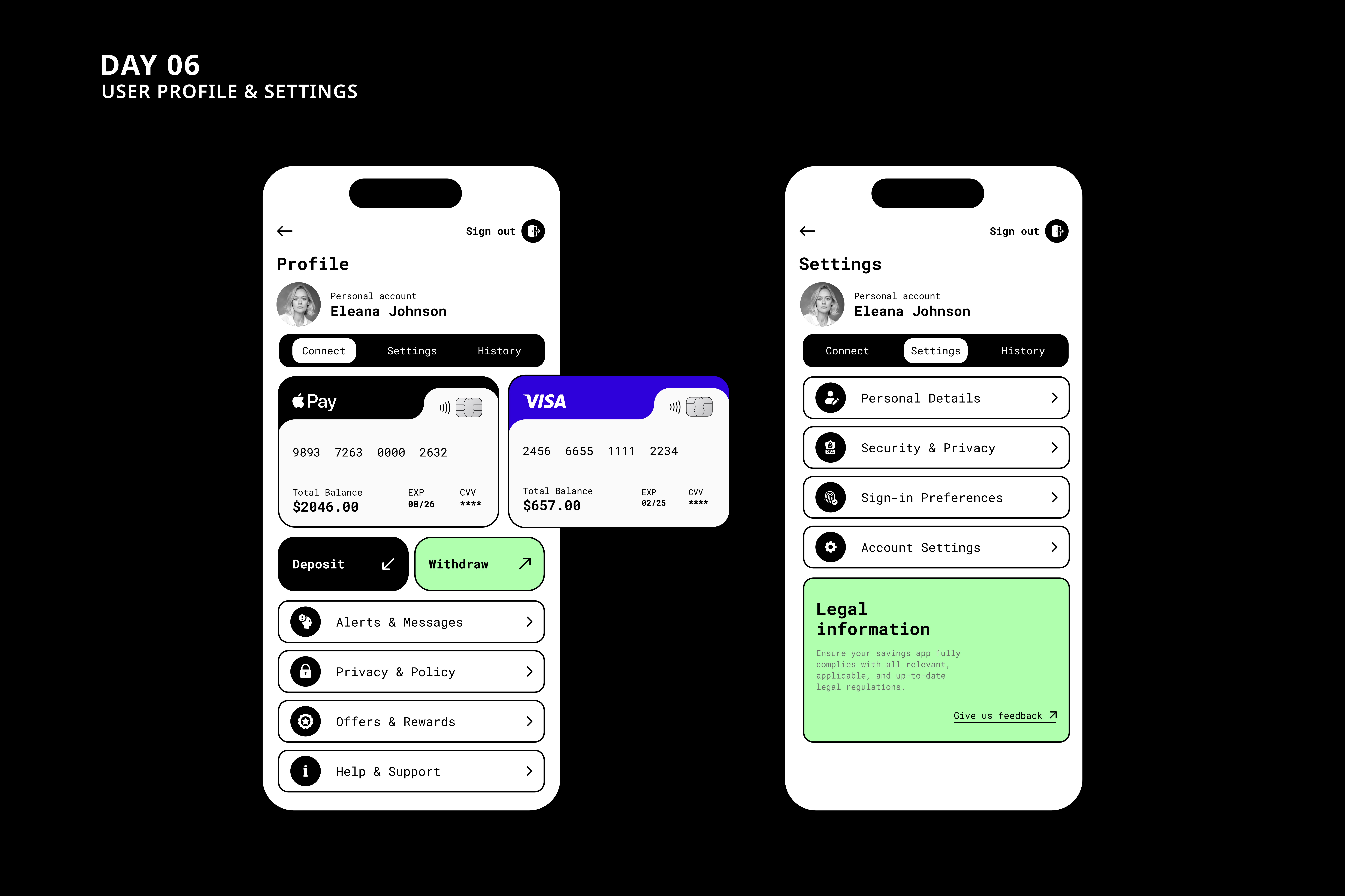
Presenting the UI design for a savings app, characterized by its modern and minimalist aesthetic, aimed at providing users with the simplest and most intuitive interaction experience.
Day 7: 404 error
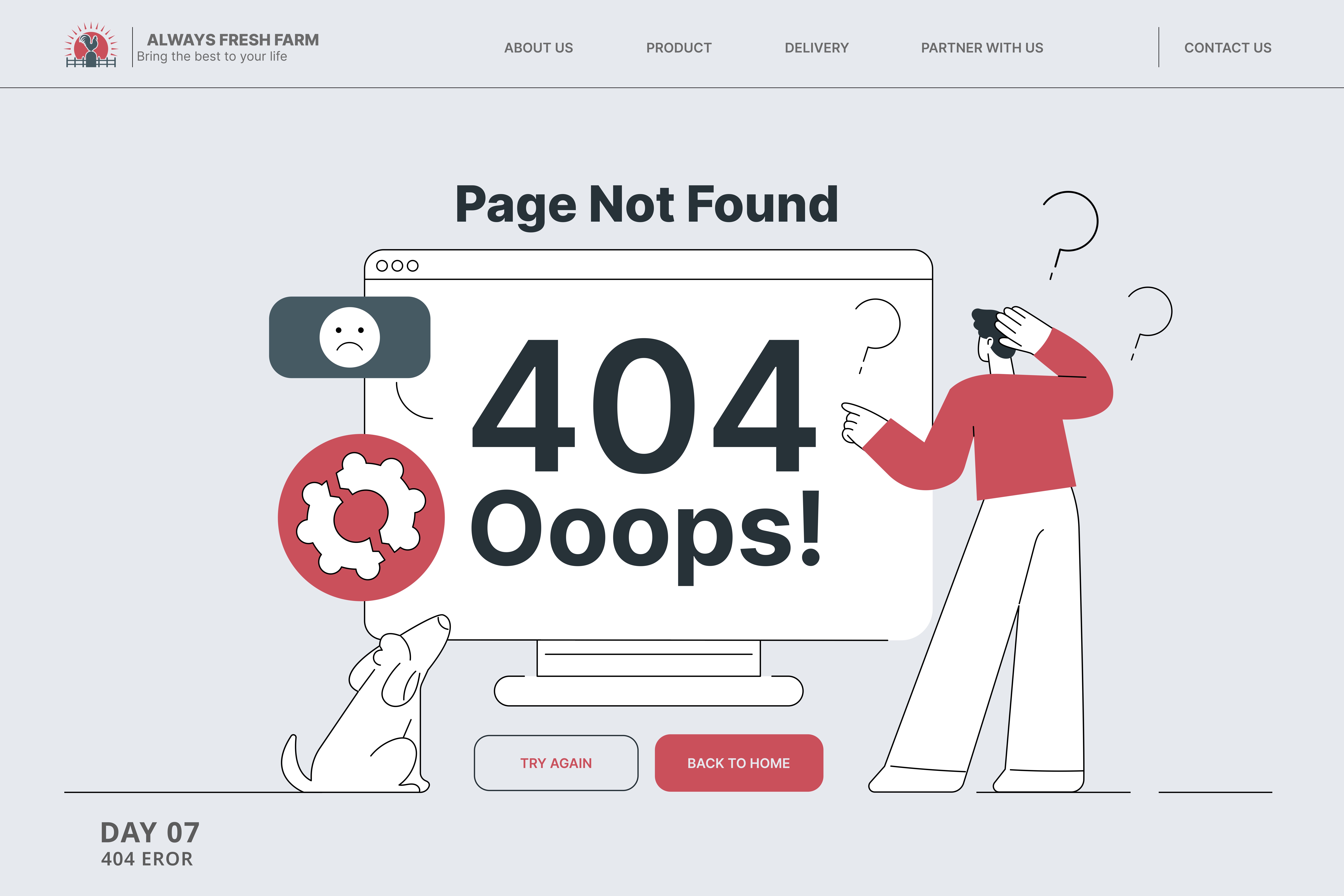
As this topic is quite captivating, I aim to transform this dull page into something engaging by incorporating illustrations and typography that align with the theme of the website I intend to create.
Day 8: Music player
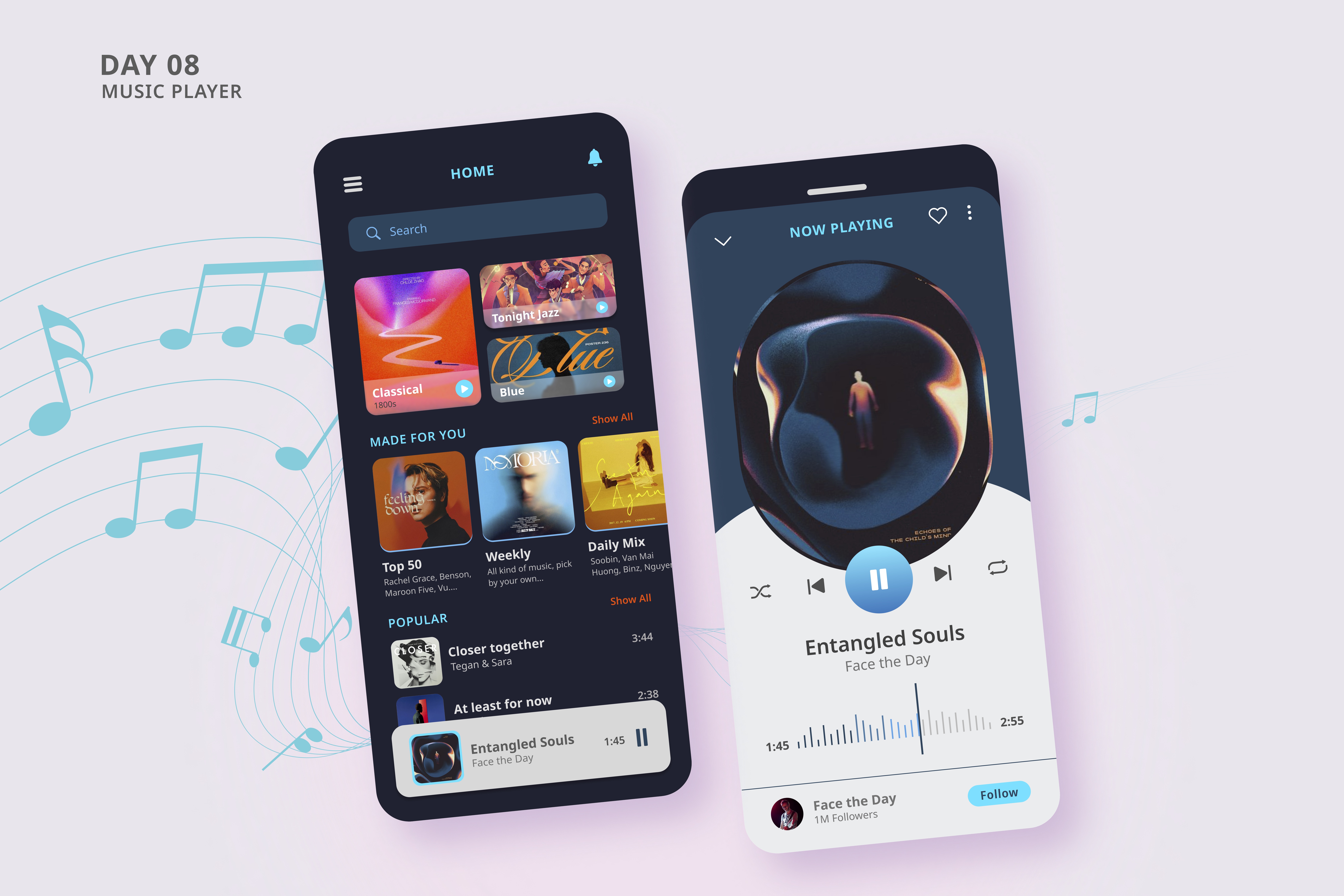
I'm focusing on creating a design tailored for young audiences, aiming for a modern and vibrant look that unmistakably conveys the essence of a music app. The design will incorporate contemporary visual elements and lively colors to appeal directly to the target demographic I’m leaning towards , making it clear at first glance that it's dedicated to music.
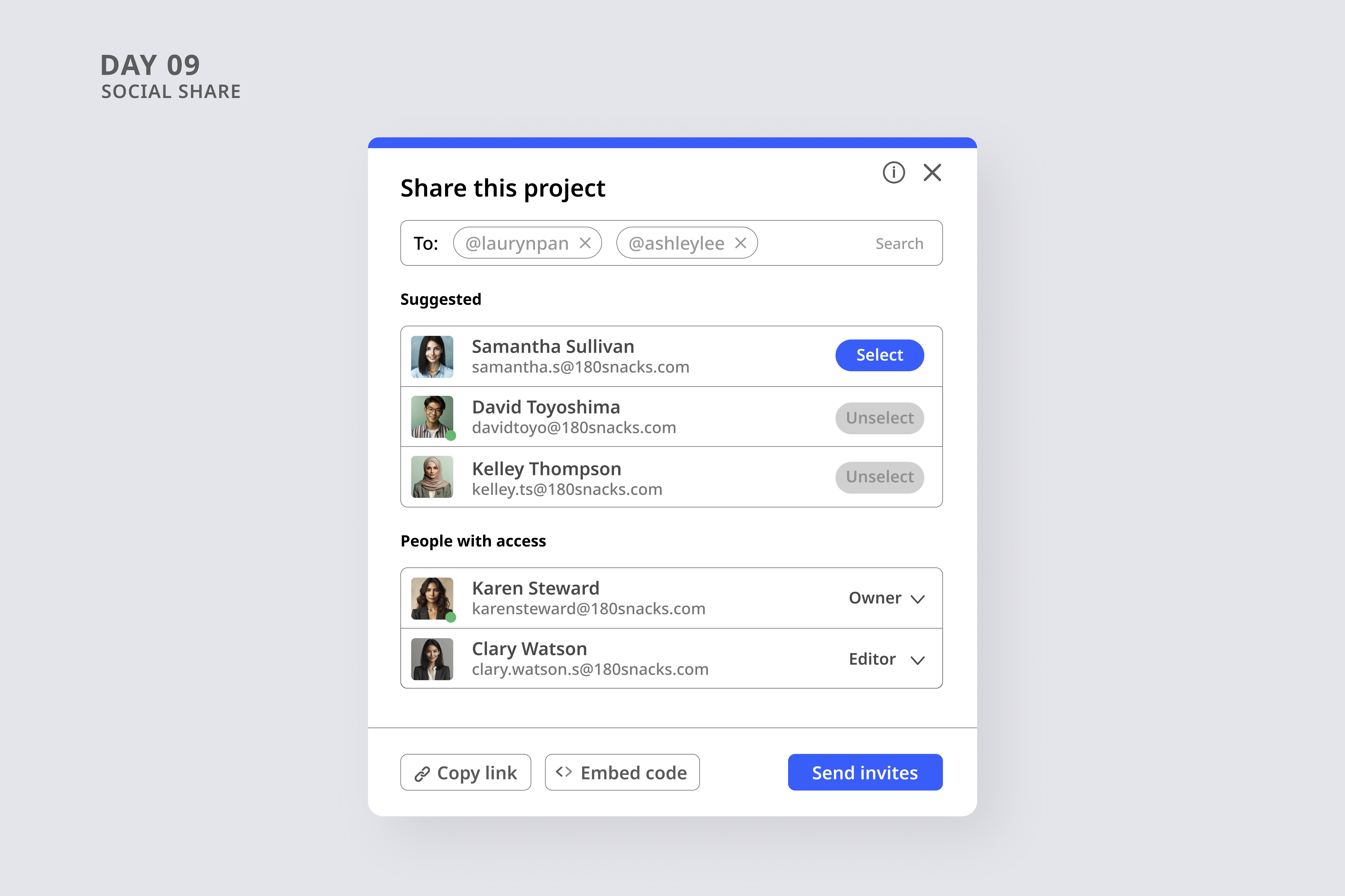
Day 9: Social share
This is the UI design I created for a project sharing modal, designed to be incredibly easy for users to set up.
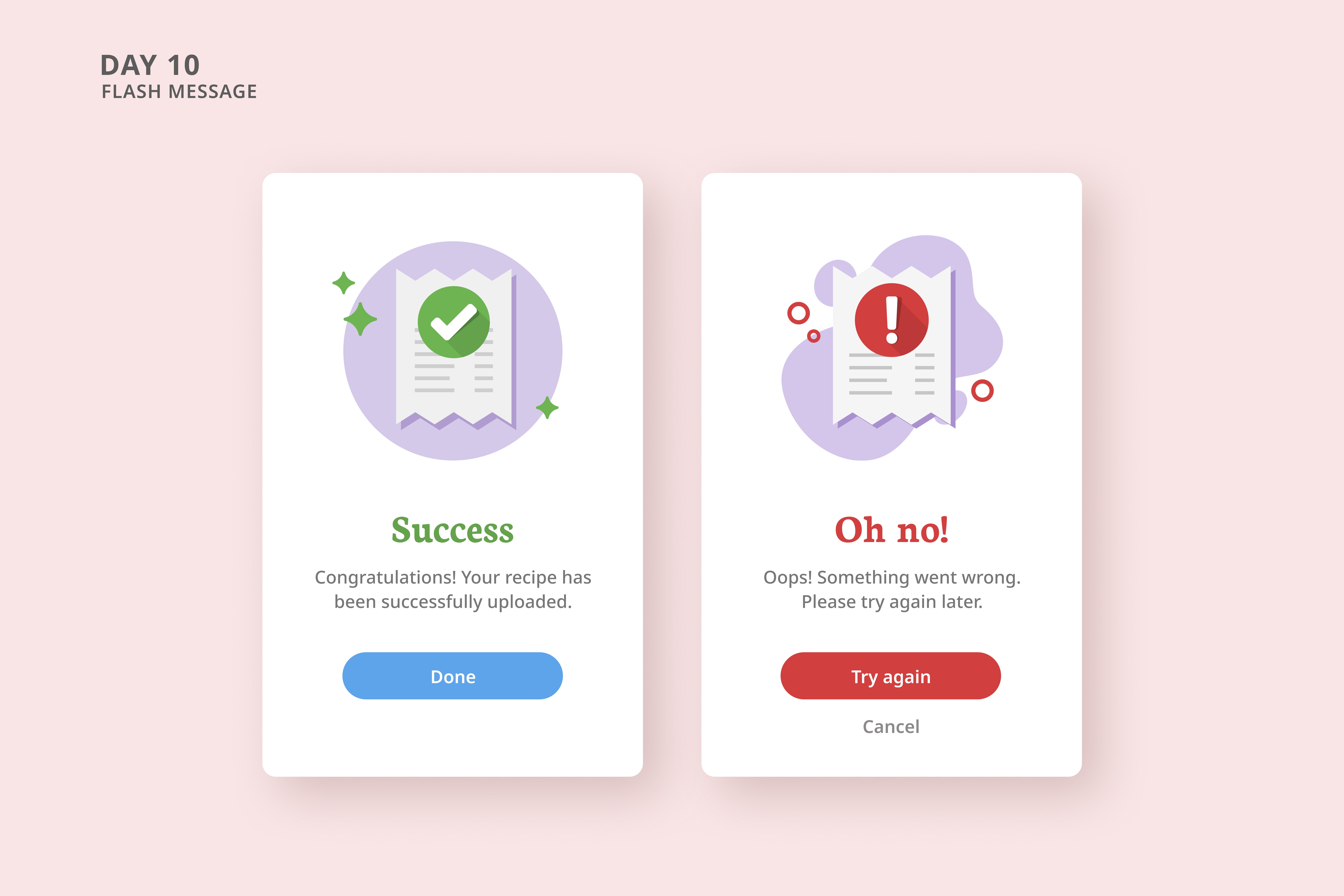
Day 10: Flash message
This design showcases the flash message for a recipe app on a mobile screen, indicating the success or failure of uploading a recipe. It features a highly recognizable illustration integrated with informative details.
