Turning ideas into bold visuals,
from interfaces to brand stories.
ABOUT
CONTACT
OVERVIEW
︎UX/UI
• WoofCare App• 10-day UI challenge
• Car Infotainment
• AirXplore App
• Asian Flavors App
• HomeX App
︎Typography
• Type Specimen• The Coolest Scoops
︎Branding/Packaging
• Meet Fresh• Logofolio
• Lucky Paws
• Non-dairy Yogurt
• The Harvest
• Ponzi
• Aveeno Baby
• Aroma Forest
• Gogo Alphabet
︎Motion Graphic
• Kinetic Type• One Day in December
.
.
Ponzi Red Wine
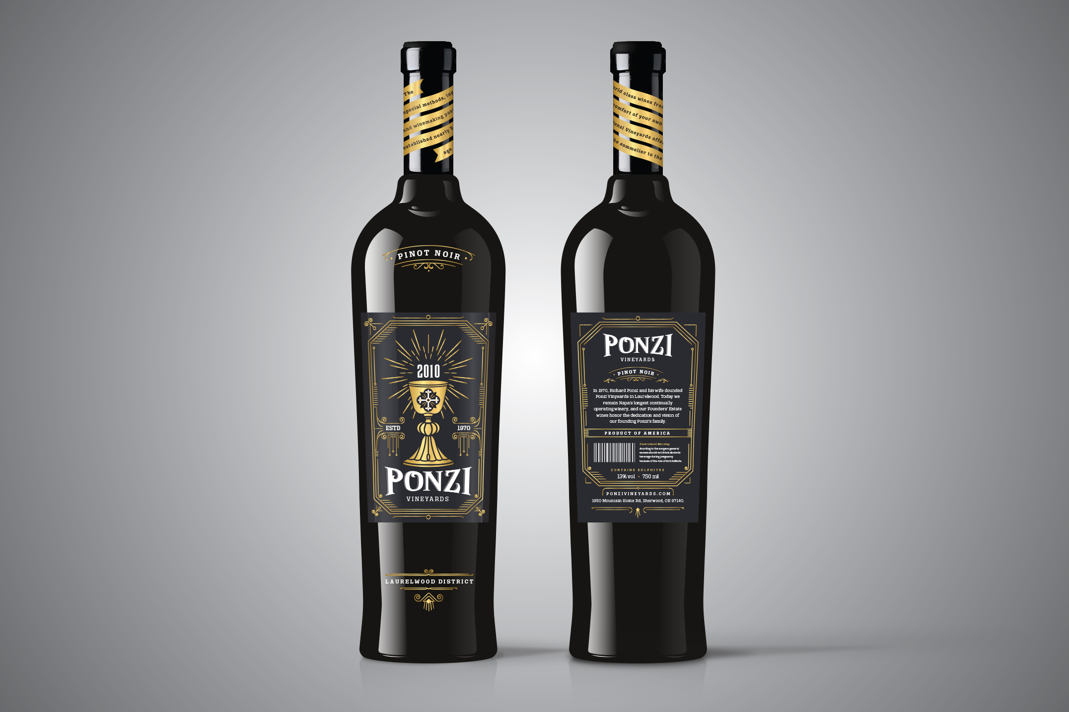
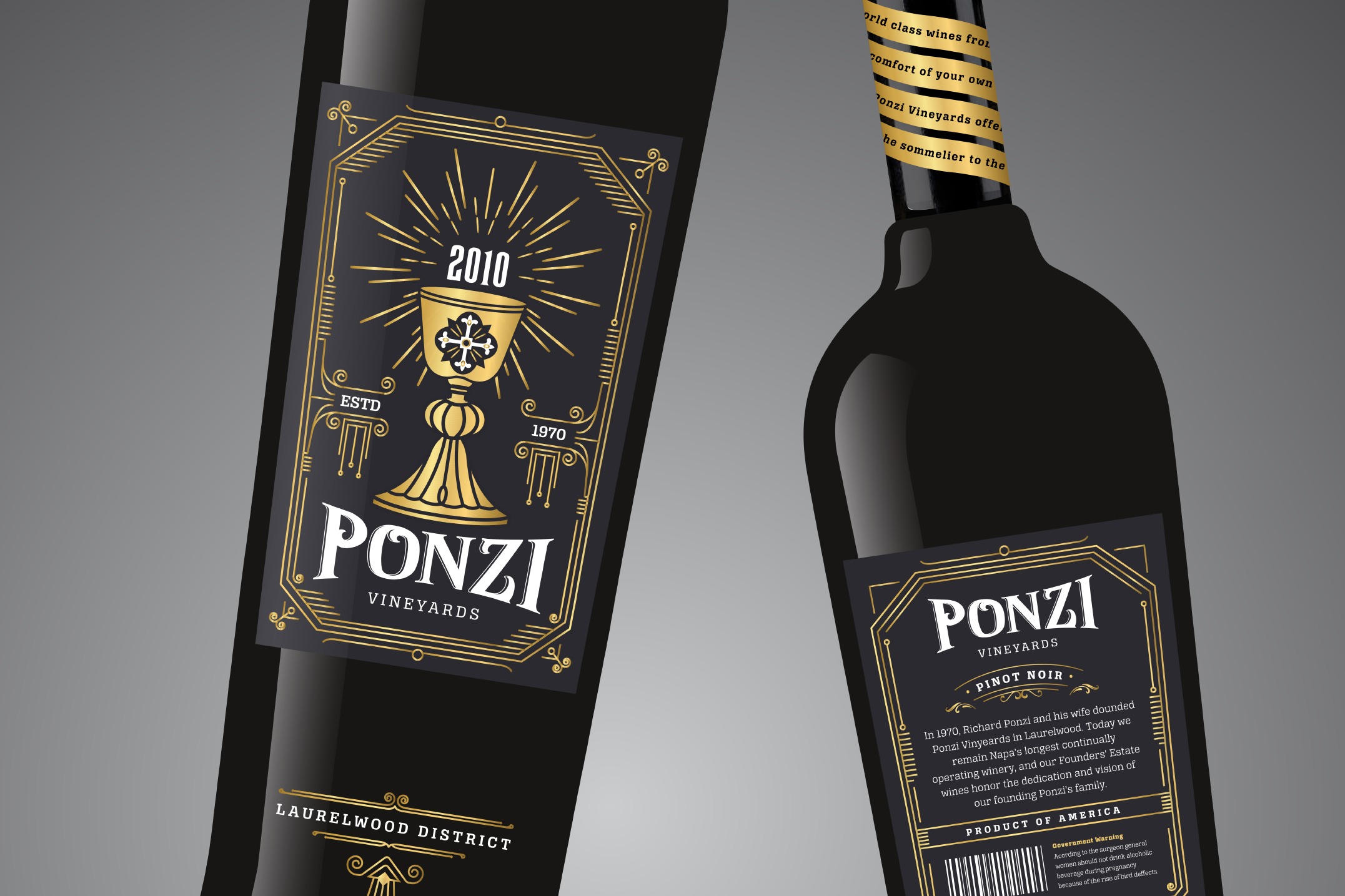
PONZI HIGH-TIER
( Front and Back View )The high-tier packaging was inspired by the story of the father, who is a first-generation Italian immigrant. He grew up with the belief that wine is a sacred drink that always serves a special purpose. To honor this tradition, I incorporated an image of a chalice on the label and infused the design with an art deco vibe to give it a formal and luxurious feel.
The color scheme of the high-tier packaging is carefully chosen to evoke a sense of sophistication and elegance. The label's primary color is dark grey and gold, which are associated with passion, power, and luxury. Also, the gold accents on the label add a touch of opulence, symbolizing the high quality and premium nature of the wine.
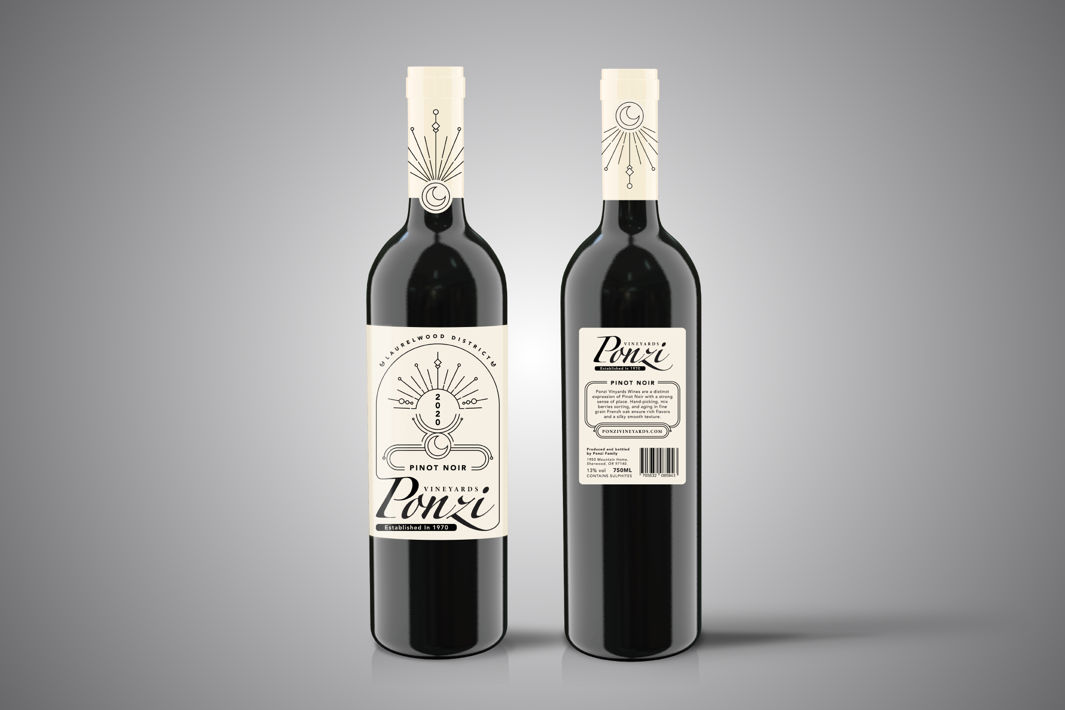
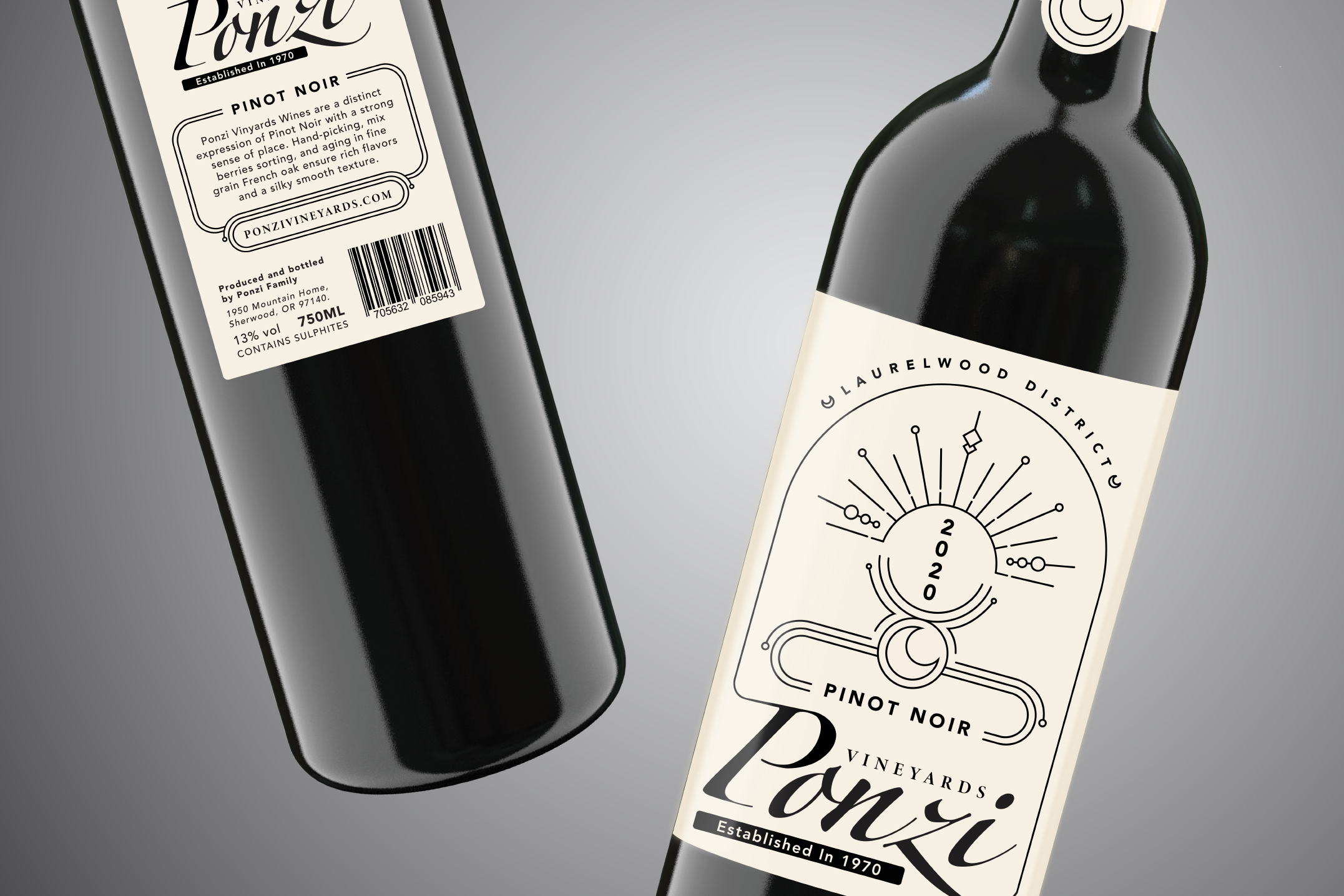
PONZI MID-TIER
( Front and Back View )The mid-tier packaging draws inspiration from the second generation, represented by two daughters who are taking the wine industry by storm. As strong women who are making their mark, I wanted to capture their energy and vitality in the packaging design. To achieve this, I used the images of the sun and the moon to symbolize each of them.
The sun represents the daughter who is bold, confident, and takes charge.
On the other hand, the moon represents the daughter who is calm, reflective, and intuitive.
Overall, the mid-tier packaging design is meant to showcase the unique personalities and strengths of the two daughters who are driving the family business forward. Through the use of powerful symbols, colors, and designs, the packaging aims to communicate the daughters' influence and the quality of the wine they produce.